Ux Design
Context:
I collaborated on an iOS app for a local coffeeshop in Queens. Our Goal was to design an app that enabled users to easily order for pickup or create a reservation to spend time working/hanging out in the busy cafe (similar to Starbucks’ idea of the third space).
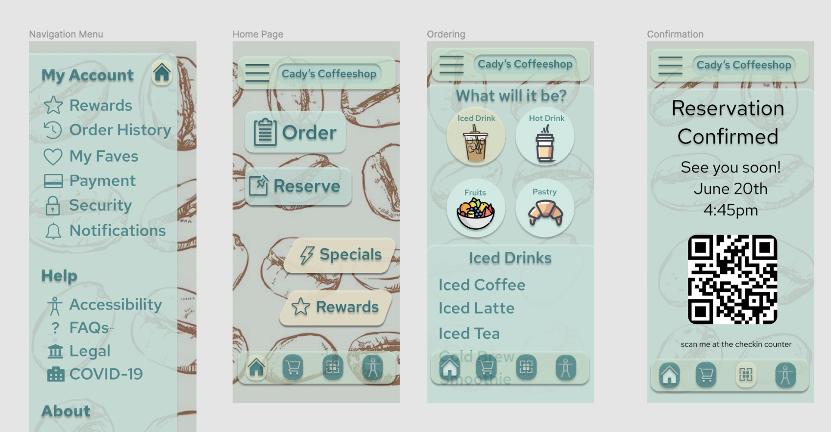
Above: Four screens of a rejected hi-fi prototype. The consistency was lacking on the reservation page. After usability research, real images of products replaced the illustrations and color combinations were changed to provide for better accessibility.
Process:
Once our tentative goal was established we began with user research to build empathy for our users. We started interviewing users/potential users to create user personas , user journeys , empathy maps and problem statements. From here we were able to better define our goal to meet user needs. Our users needed an expedient way to effectively order coffee for pickup and make a reservation at our busy location so our goal became to create an app that would allow for that.
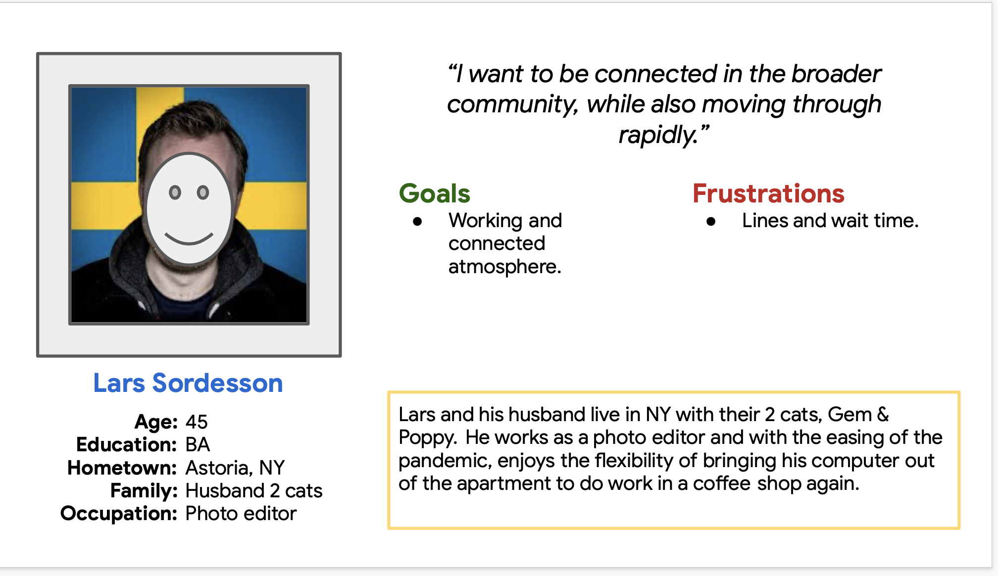
User Persona for working professionals I based on users I interviewed.

User Journey for another one of our user persona’s based on user interviews. This represented our Gen-X college student group.

Competitive Audit Report for direct & indirect competitors.

UX Design Storyboard. We illustrated how Crystalia would feel as she interacted with our app: from the initial problem she faced when wanting a coffee, through using the app, to happily picking up her coffee.


Designs:
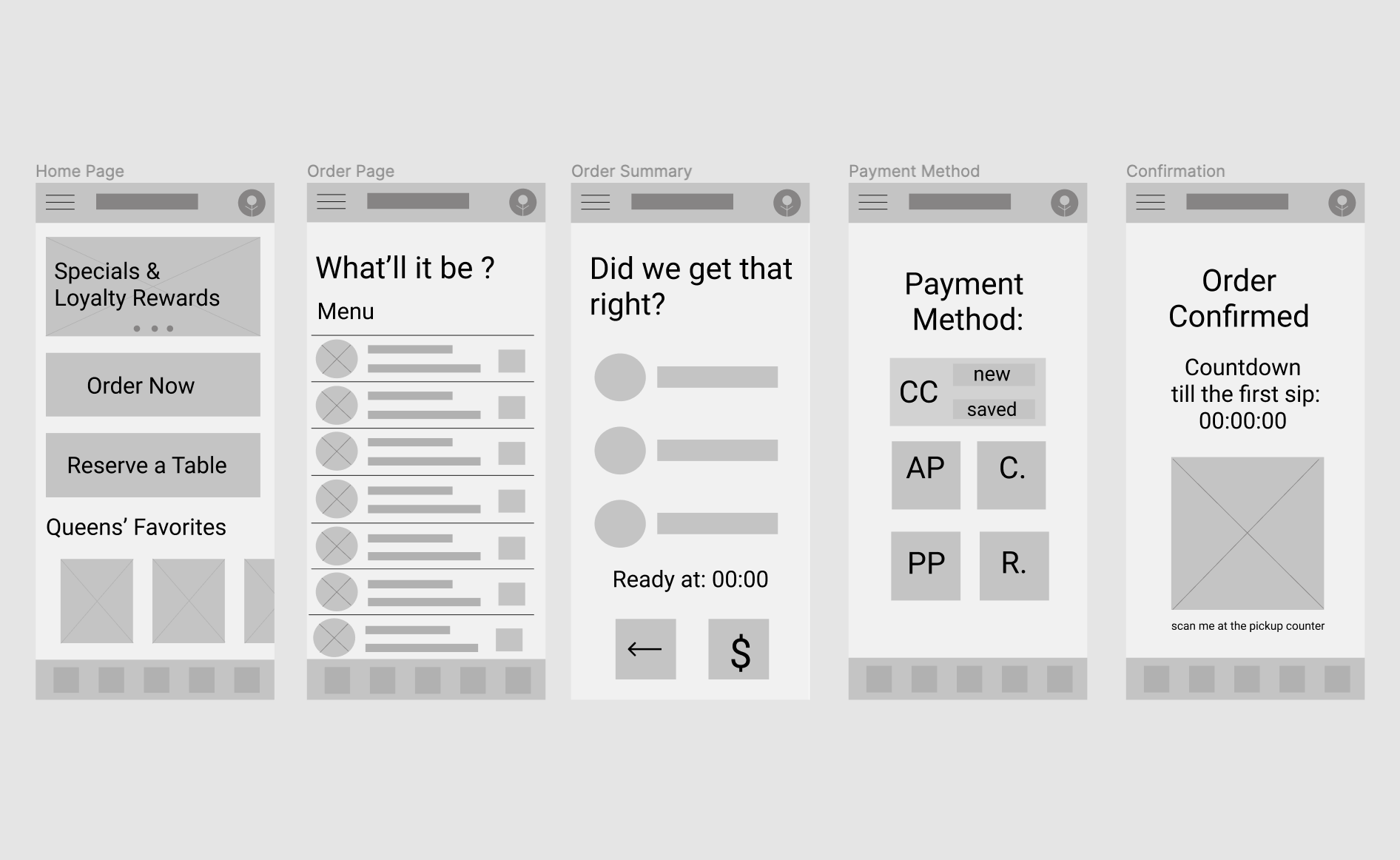
Lo-fidelity prototype of our app as created on Figma.

Rejected hi-fidelity prototype as created on Figma. The design felt too sterile when tested with users. They wanted something with more personality to it.

Another rejected hi-fi iteration that now felt a little too busy. Drop-shadows likely to be reduced/eliminated.